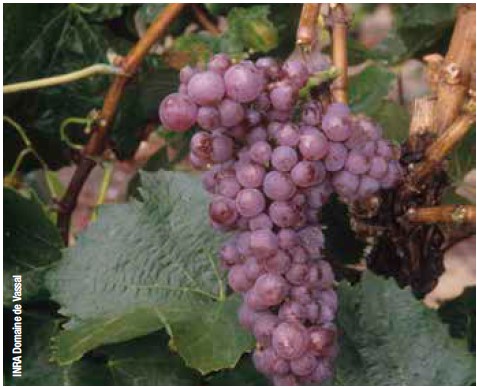
Laherte Petit Meslier in the tasting round
Yes @laherteaurelien makes a monocépage of this one. Great Meslier it is:
The golden colour would suggest something dosée, but look closer and you notice a hue which points to slight bitter influences. And indeed, on the nose we get a whiff of smoke, certainly straight after the pour; quite an opportunity to use the word ‘empyreumatic’... Did I mention Meslier already? One to one it is. But nothing referring to your cooking qualities; it’s more like a distant secondhand puff of Belinda – I’d not suggest you buy that for comparison; trust me as smoker it’s trash but as Meslier aroma it’s excellent full stop. Crispy dry cigar smoke fits better.
Certainly, since this all is followed up, much more persistently, with quite some mature lemon and a whole slew of herbs and spices notes. It smells like a merry-go-round of eucalyptus, dill, thyme, spearmint, soft mint, basil, anison, verveine... wormwood even; those that know génépi, find it here, too.
The first sip jumps in with a most delicate mousse, a sensible but not too fatty mouthfeel, nicely balanced with lemon dominant in combo, and ginger/pineapple/mirabelle and dry lemon rind flipping back and forth. In the remarkably long finish, the rind does a gentle cleanse.
But I couldn’t find any cardamom that some mention, nor cocoa or coffee. All in all, in cocktail terms it would fit in the range of the French 75 and a Fleurette.
I’ve tried a little bite of camembert, but you shouldn’t. The bitter of the wine is lost but notches up in the cheese, which tastes odd. The fit with lightly aged Comté or same-Gouda is perfect, however. Sushi should work, too, if with a suitably subtle pinch of wasabi, no more – harsh coriander, algae, chervil, wasabi as such weren’t in the nose.
In summary: All of you should have a taste of this one, or one couldn’t be trusted on champagne connoisseurship.
[Degorge 12-2021, hence the progressed maturity]
Links:
https://maverisk.nl/de-forgotten-four/ for Petit Meslier
https://maverisk.nl/champ-sigaar/ on the cigar smoke angle
https://maverisk.nl/geneprima-spul-hoor/ on génépi
https://maverisk.nl/mirabelle-wil-iedereen-welle/ on mirabelle